
Lean In and Look Closer with Susanne Hartke
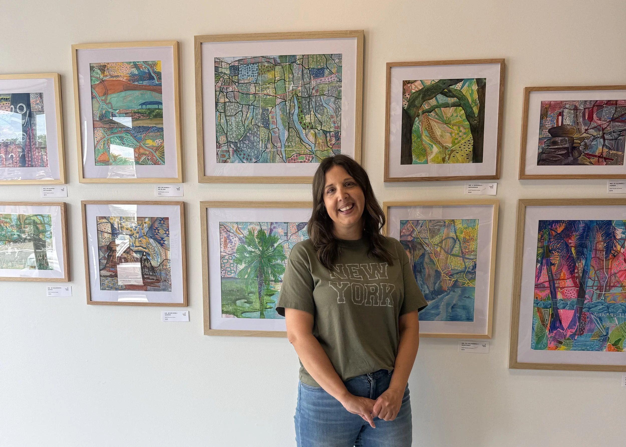
Susanne Hartke with her show of mixed media paintings entitled “Nifty Fifty”, featured this September at The Gallery.
Welcome to another conversation with our visiting artist of the month! This September, we’re getting to know Susanne Hartke, a visual artist, graphic designer, and arts educator from Avon, New York, as she takes us on a road trip through 12 states in her “Nifty Fifty” collection of mixed media paintings.
Susanne met myself and our lovely SUNY Geneseo intern Skylar at The Gallery last Saturday, wearing a Taylor Swift t-shirt and ready to chat about her show. Before we dive into each piece, a bit of backstory:
Susanne has participated in several of our group shows at The Gallery, notably Love From Geneseo, our annual February postcard show, and most recently, she submitted some beautiful bookmarks for our summer bookmark show. Over the past couple of years, we’ve fallen in love with Susanne’s work and style and have been so excited for her to have her own show in our space. This is her first solo exhibit since her college days.
As a graphic designer and art teacher, she’s spent most of her career making art for hire, designing logos and taking requests, without having much time to work on her own artwork. She started painting again a few years ago, and got to apprentice Matthew Mederer, a muralist for LivCo’s county-wide mural project LivCo Walls. This sparked a renewed interest in her personal art and she made an appointment with us at The Gallery to chat about how to make some prints of her work. Our manager at the time, Maddie, took a look at Susanne’s work (loved it, obviously) and noticed that some of the lines running through her colorful abstract pieces reminded her of map lines. Susanne loved this observation and realized that was the framework or structure she could build a body of work around. It was almost right then and there, back in May of last year, that Maddie and Susanne agreed that she ought to put together a whole show of her work. Here at The Gallery.
Cut to today, the show is up on the wall this September and is entitled “Nifty Fifty” It gets its name from the year of her life in which she made these paintings - her 50th year. In fact, we’ll be celebrating this show with an art party on September 18th, the last day of her 50th year. September 19th is her birthday! Below you’ll find each painting and a bit about Susanne’s process in making each one. Each piece is numbered in order of when its state joined the union, which is great because now this blog post is part artist intro, part geography lesson, and part history lesson!
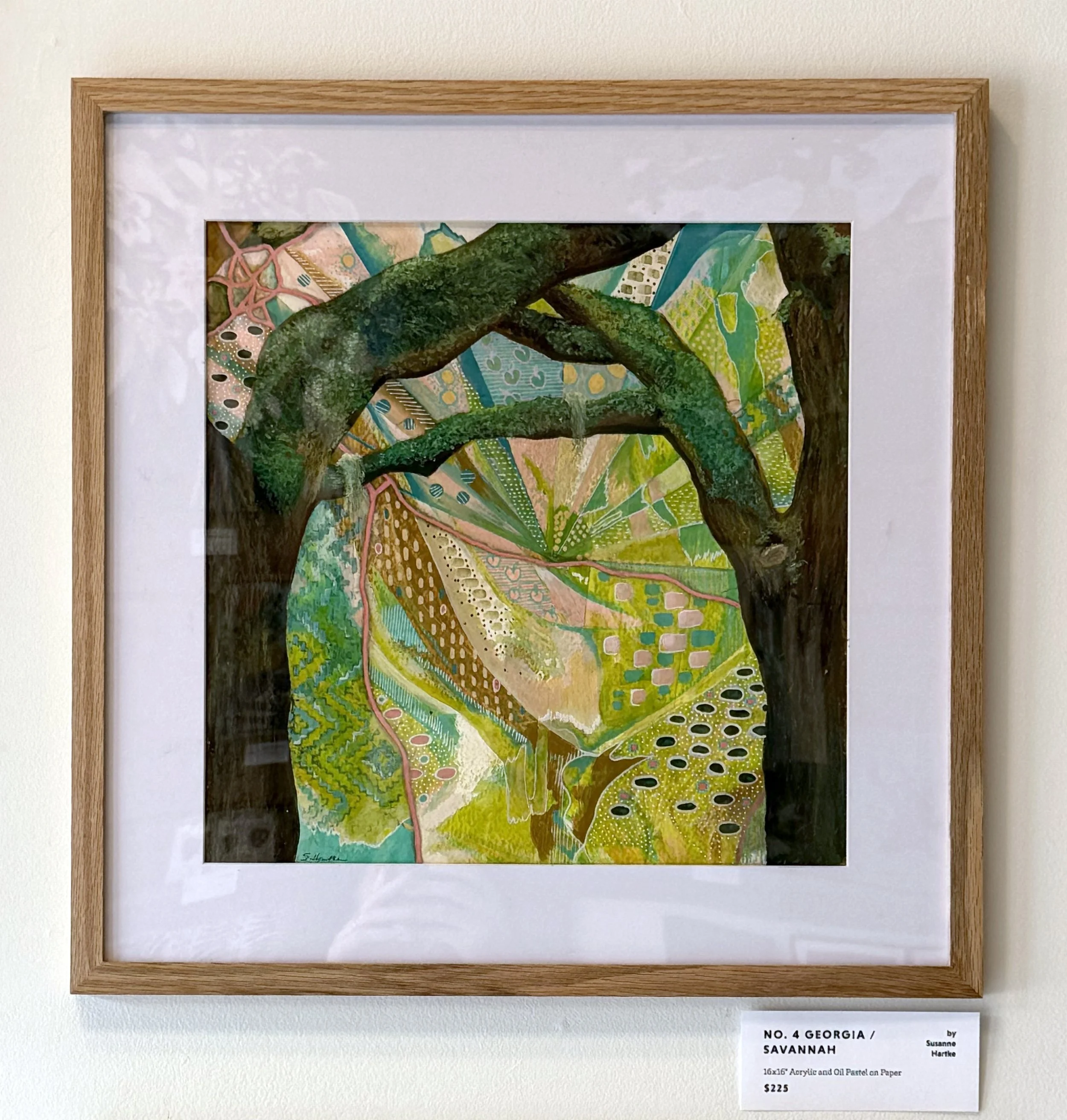
No. 4 GEORGIA / SAVANNAH
When you stand before all 12 of these paintings at The Gallery, you’ll notice some shared elements across the collection. First, they’re built loosely on maps. See those peach-colored street-shaped lines? Each painting is grounded in the street/route lines in an area of the state, and, (except for NY, which we’ll get to soon) is paired with a landmark illustration unique to that state. Here we have some majestic Savannah trees painted with acrylic and texturized with oil pastel.
Rounding out the composition, between the trees and the street lines, Susanne fills the spaces with abstract yet meaningful patterns made sometimes with a brush but mostly with acrylic markers. The result is a stunning juxtaposition of a realistic landmark surrounded by an abstract wonderland. Look closely and you’ll find some Georgia peaches in the center here!
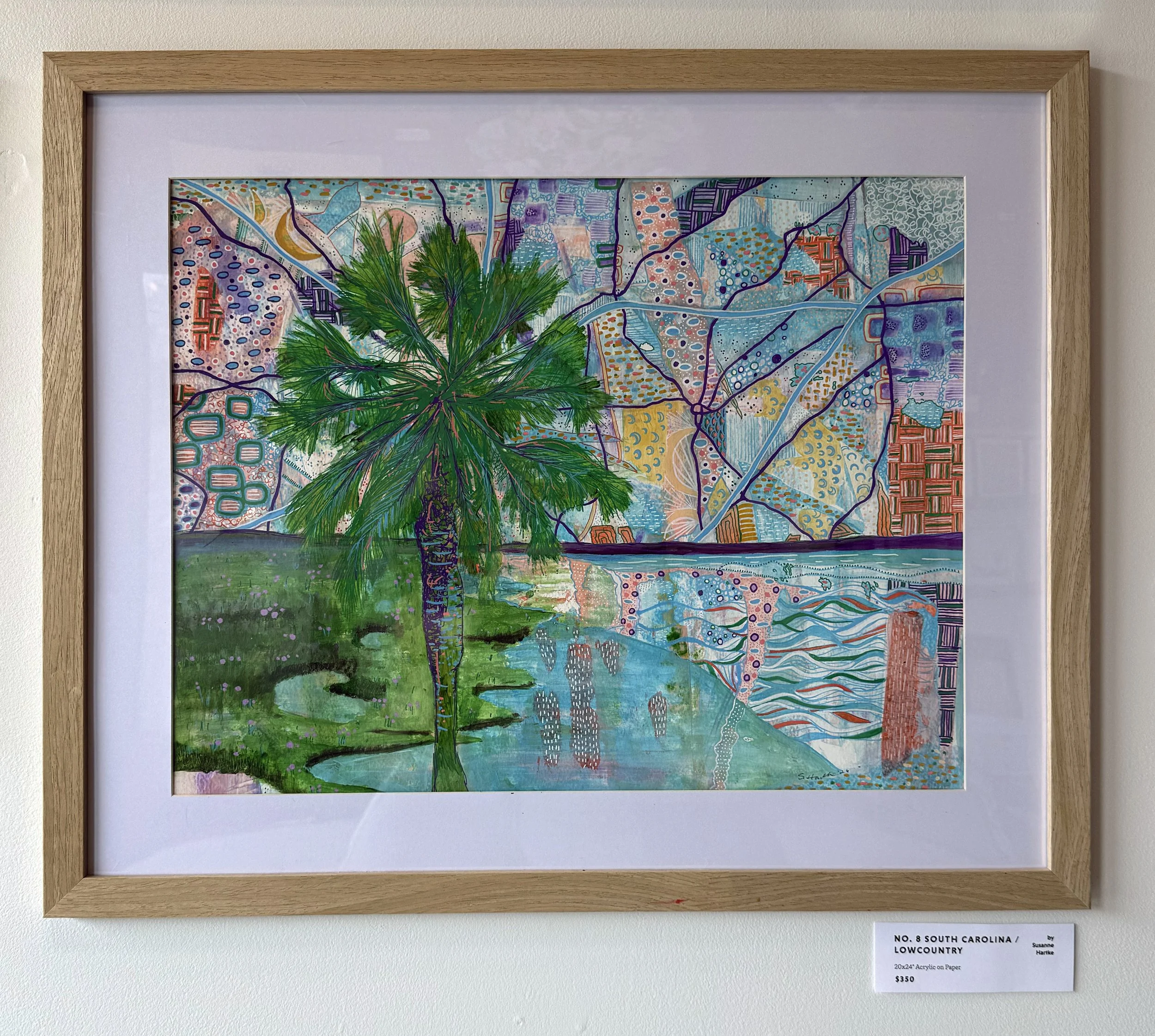
No. 8 SOUTH CAROLINA / LOWCOUNTRY
Susanne recounts that she started this South Carolina painting, then, unhappy with how it was progressing, stowed it in her closet for a while. We all have those moments, right, where you start something, feel a little stumped, then go for a walk or hide it in a closet, and return to it with fresh eyes and a renewed perspective. I love when that happens. Sometimes a little time and space is all you need to return to something with a new mindset.
Look closely at this scene from the low-country of South Carolina, where Susanne and her family have vacationed many times, and you’ll find patterns made of crescent moons (like they use in the South Carolina flag), nods to Cherokee basket-weaving, water waves, ocean foam, and marshy palmetto trees, all tucked snugly between the lines of the map .
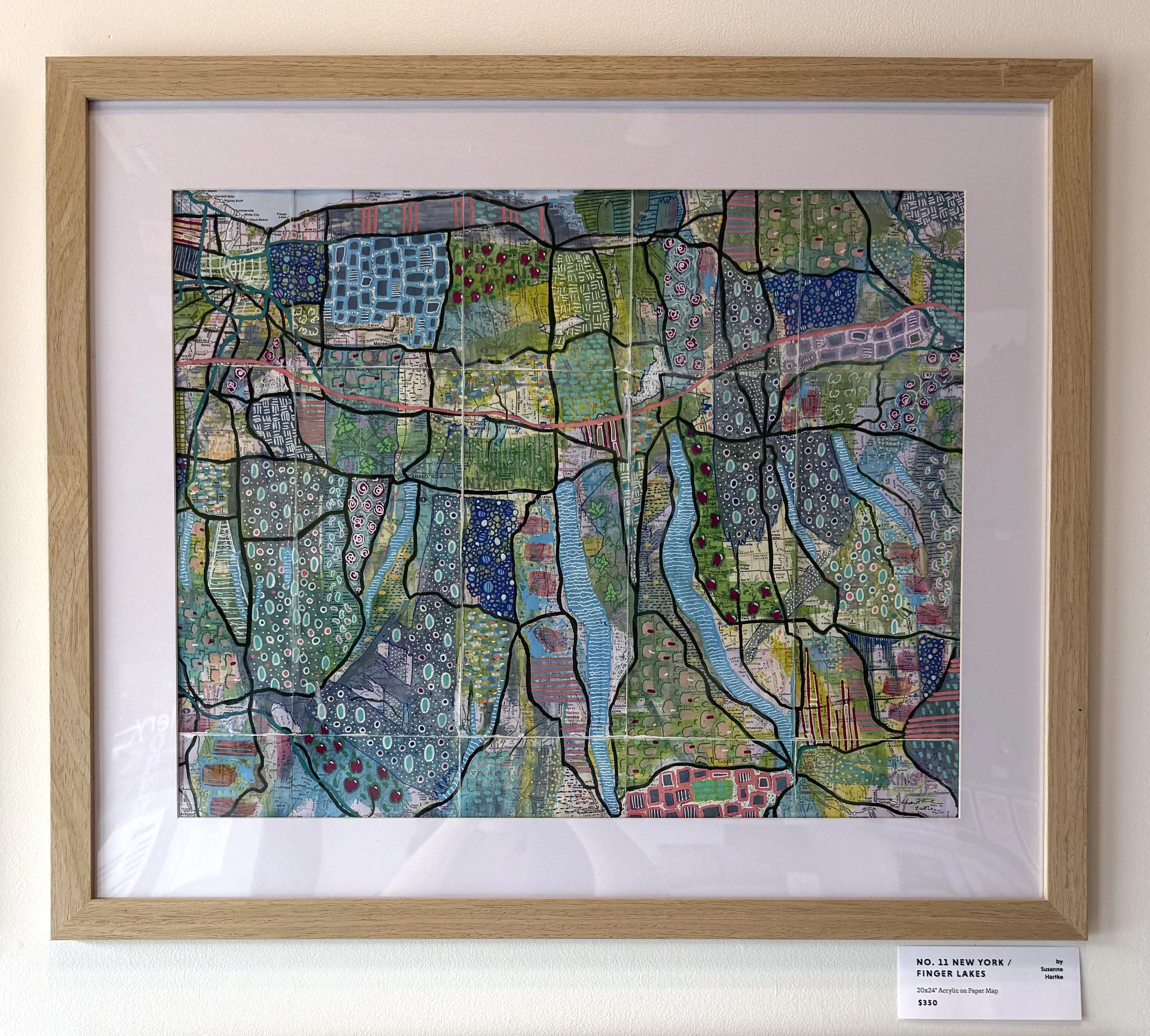
No. 11 NEW YORK / FINGER LAKES
New York was the 11th state to join the Union, but this piece was the last one created in this series. Do you notice anything different about this one? It’s painted on an actual folded map.
Painting right on top of a map posed some unique challenges. Luckily she bought two copies, as she promptly smeared too much paint on the first and lost the map lines.
She didn’t let that stop her though, and attempted again on the second, this time tracing the lines first and then going back into the shapes to add more color and pattern.
Among the shapes made by the map lines, you can find delicate patterns of NY apples, grape vines, little Ws to represent our beloved Wegmans, hops climbing poles, roses (the state flower) and on the left side near Conesus you can spot a little dock.
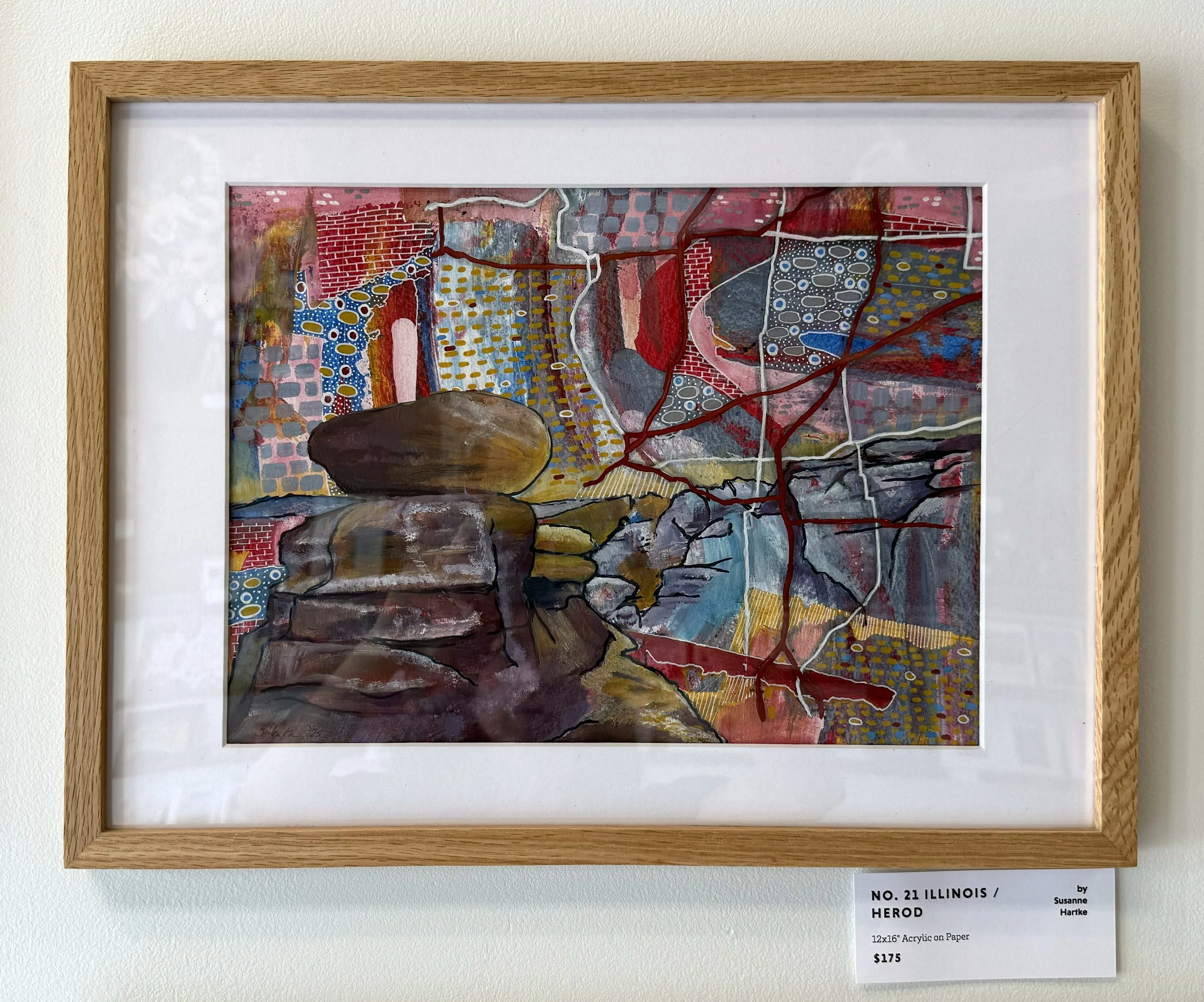
No. 21 ILLINOIS / HEROD
Illinois was the first piece created in the series, combining scenes from The Garden of the Gods in Herod, Illinois with map lines interspersed with Chicago-esque brick textures.
Susanne approached each of these paintings with a reference photo of the landmark and overlays an interesting area of the map of each state in Photoshop. Once she confirmed the overall composition, she then transfered the shapes and lines onto paper and began painting with large organic smears of acrylic. She then went in with additional acrylics and acrylic markers to bring out the map lines and define the landmarks, finishing the balance of the colors and composition with her detailed patterns. She recalled that her favorite pieces to work on were the ones that allowed her to zone out and lose track of time in.
Ah, that sweet, sweet flow state.
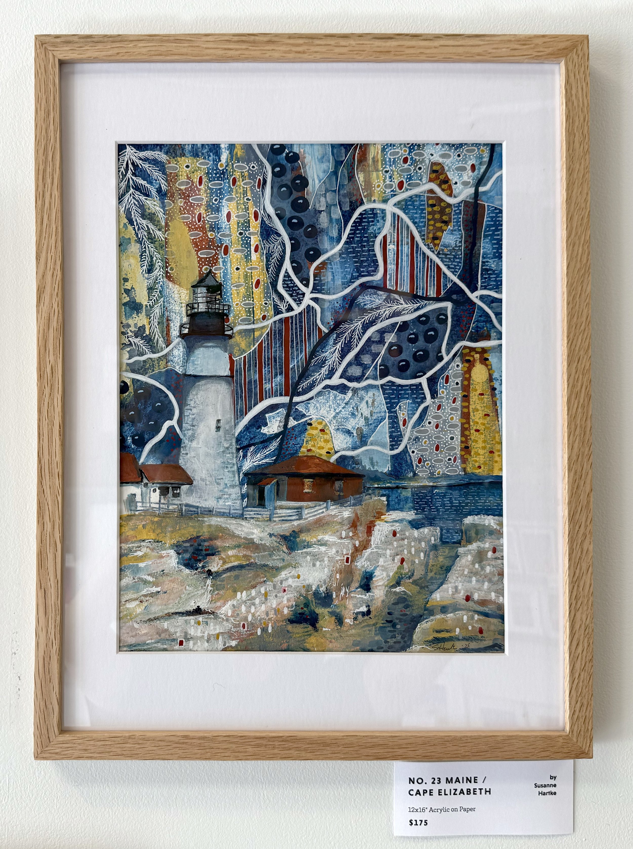
No. 23 MAINE / CAPE ELIZABETH
Next we visit Maine, which Susanne claimed is her favorite one of the bunch. She had tried a different composition for this one initially, but started over when she realized it wasn’t working. As with anything, I think there is a lot of beauty in starting something, recognizing that it’s not working, recalibrating, and beginning again.
I’m sure the original abandoned composition would have turned out beautifully but I’m a little bit glad she started over, as I think this piece is spectacular. It’s got such a lovely mix of focal points, patterns, textures, and color.
Between the lines of the map, you can spot Maine blueberries, nautical stripes, and pine branches, and of course, the Portland Head Light, aka Susanne’s lighthouse, there on the left.
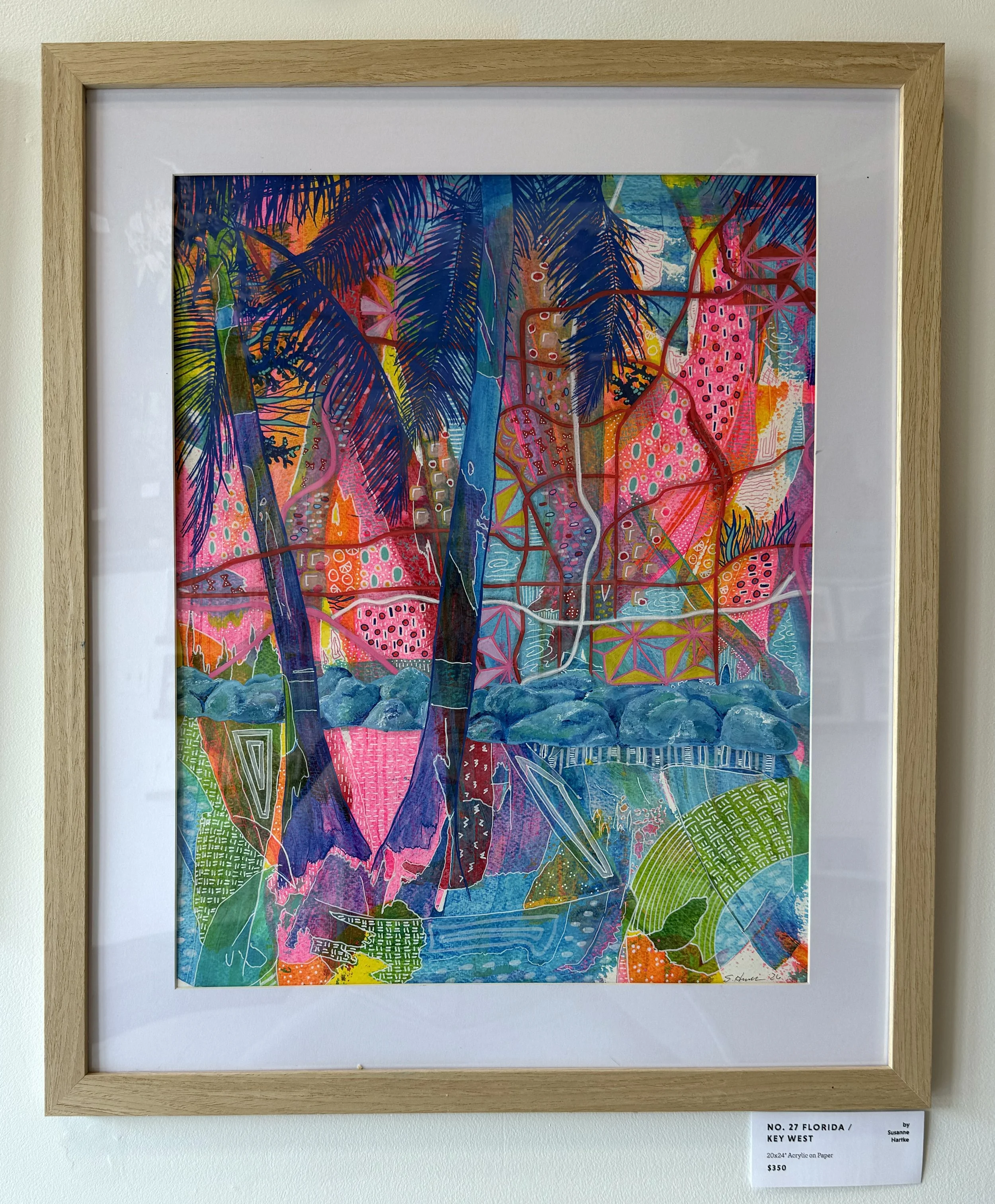
No. 27 FLORIDA / KEY WEST
The next two pieces we lovingly referred to as the Disney twins. Both states host a Disney theme park and as Susanne would consider herself a Disney adult, it’s fitting that both hide Disney-themed motifs in the pattern work. This is the most vivid of the bunch, featuring vivid sections of neon pinks and oranges. Between the road lines and palm trees, you can spot little fragments of the geometry of Epcot’s Spaceship Earth, Minnie Mouse bows, and some small clusters of 3 dots to represent Mickey Mouse.
Other Florida-inspired patterns include lightning bolts, Florida oranges, and coral-shaped elements.
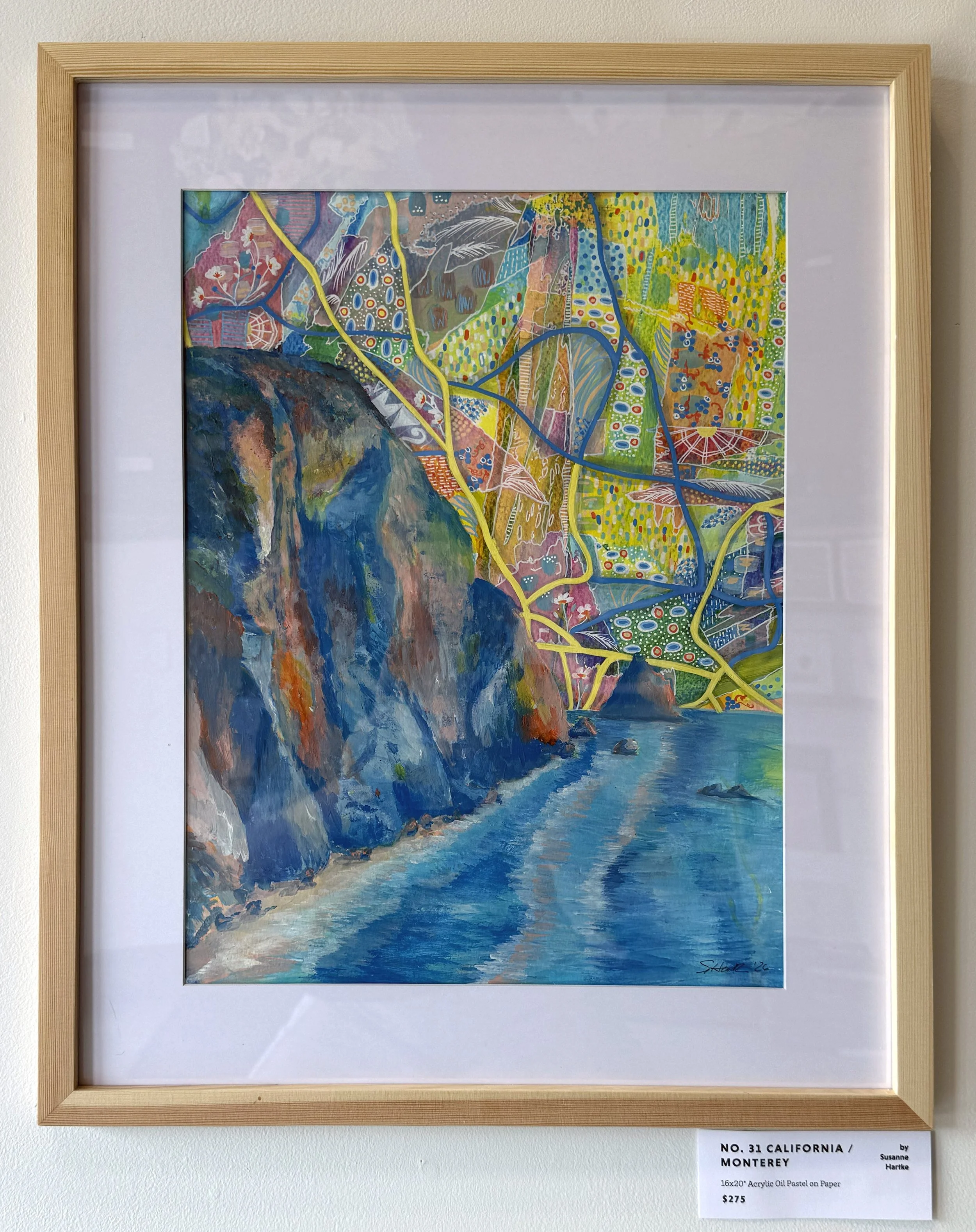
No. 31 CALIFORNIA / MONTEREY
Hiding in the second of the two Disney twins, you can spot some snippets of the structure of a ferris wheel, common to both Disneyland and the Santa Monica Pier. Can you also spot some symbols from “It’s a Small World”? This is a pretty deep cut - proof that Susanne IS indeed a true Disney adult!
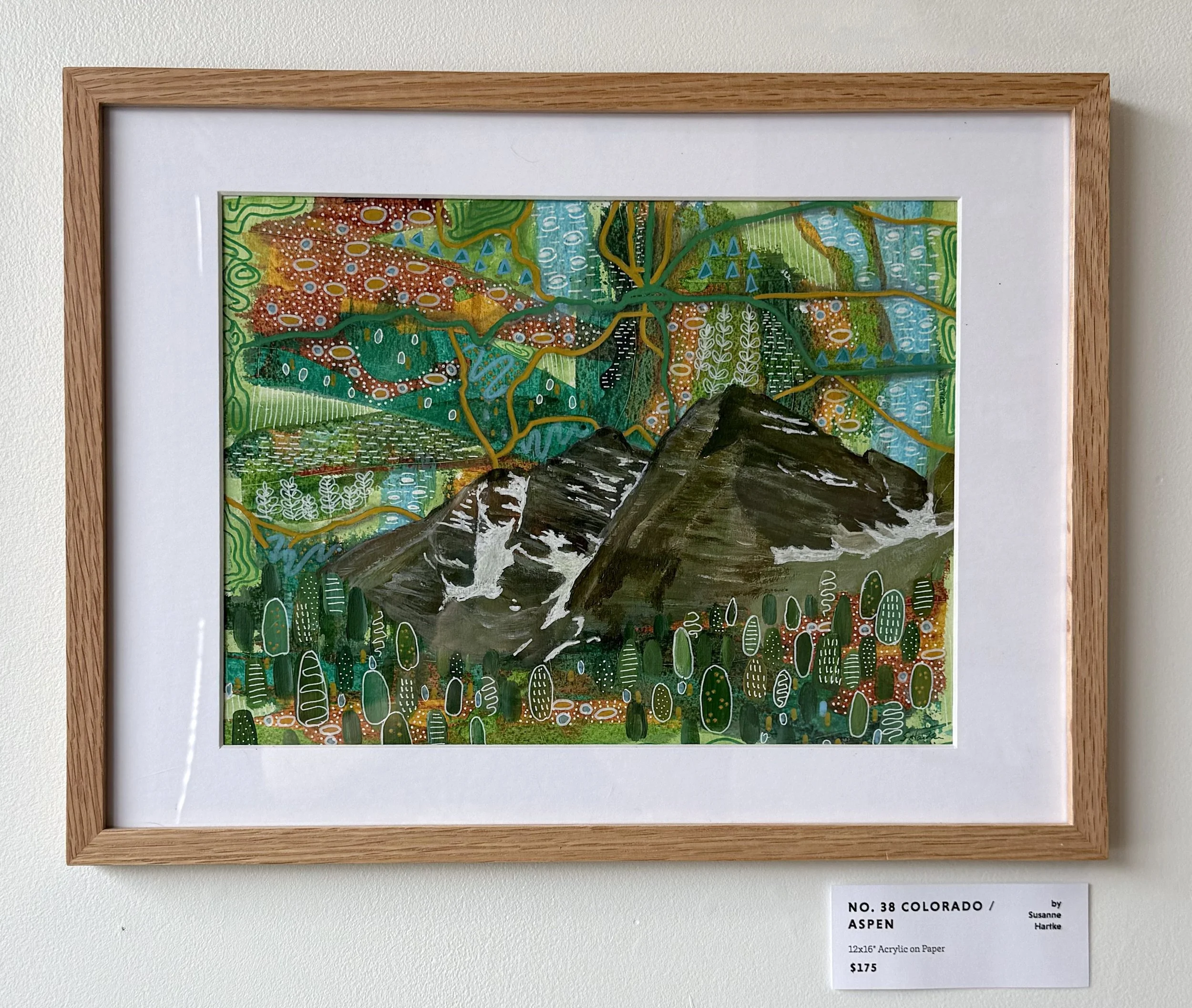
No. 38 COLORADO / ASPEN
In Colorado, you can find motifs inspired by birch trees, lupins, and shapes found on common hiking trail signs and maps - little triangles denoting trees or mountains.
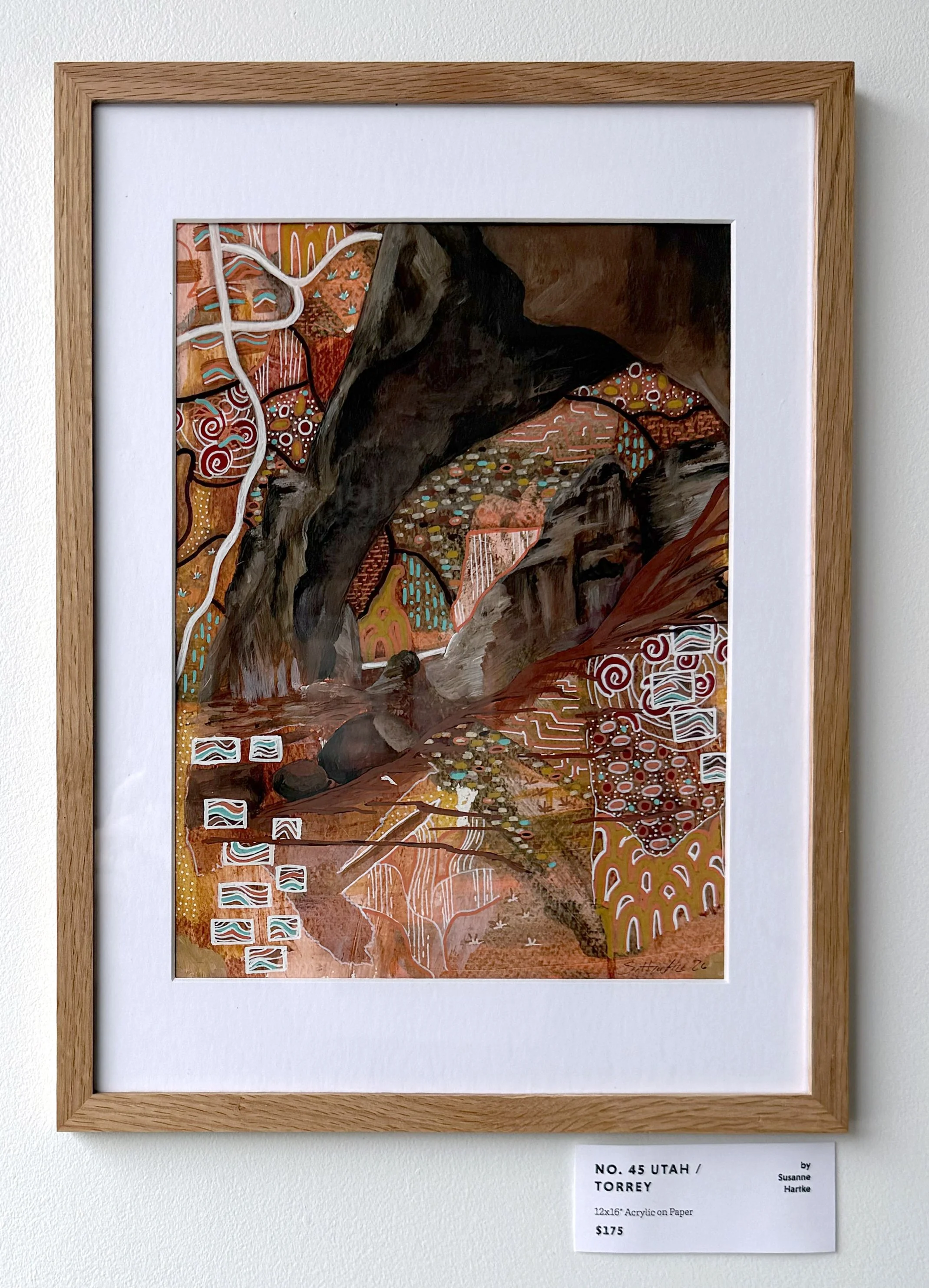
No. 45 UTAH / TORREY
In Utah, you can find patterns inspired by sage brush, rock formations, and spiral petroglyphs.
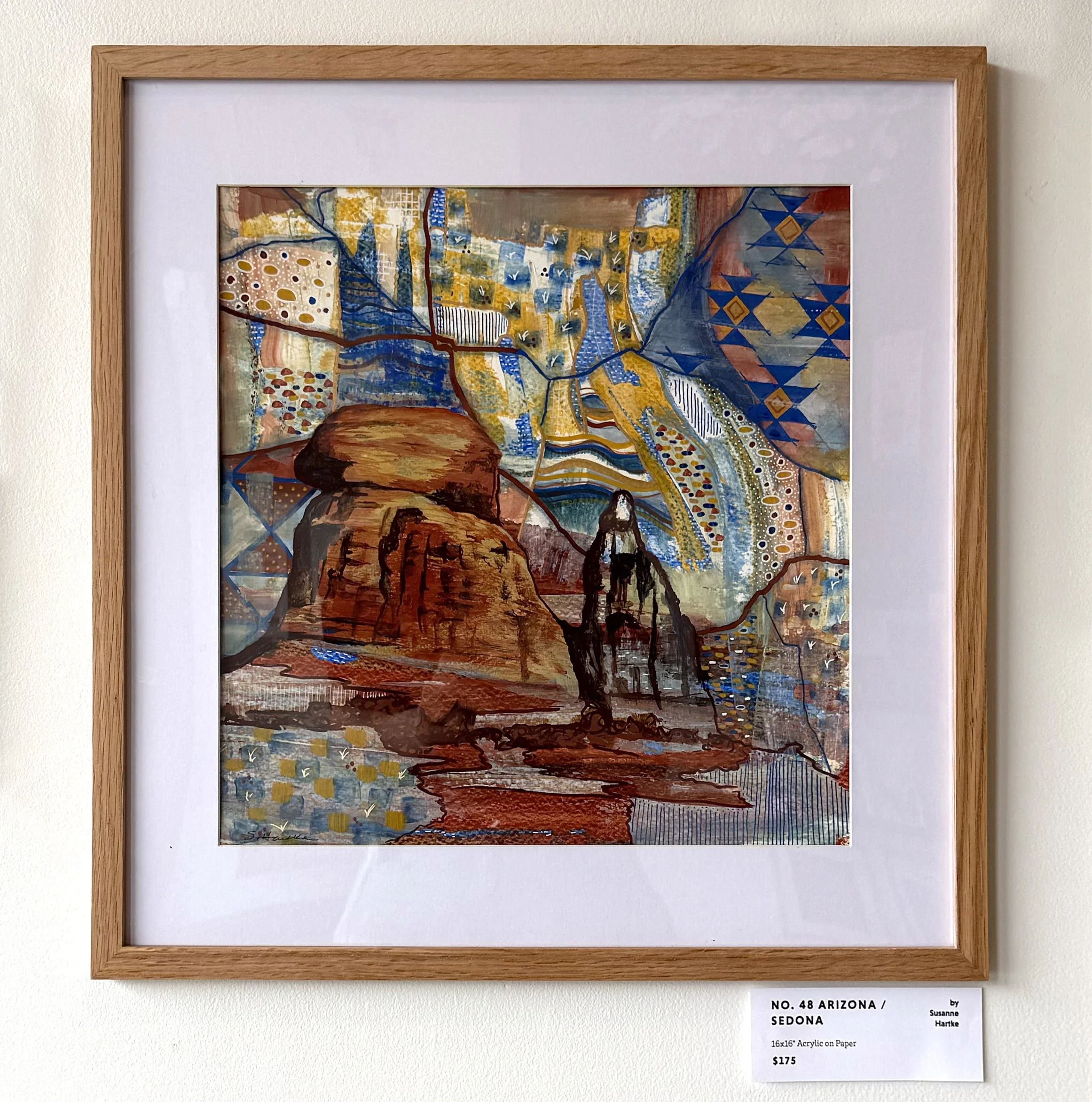
No. 48 ARIZONA / SEDONA
And between the rock formations and street lines of Arizona, you can find cactus spikes and Navajo-inspired patterns.
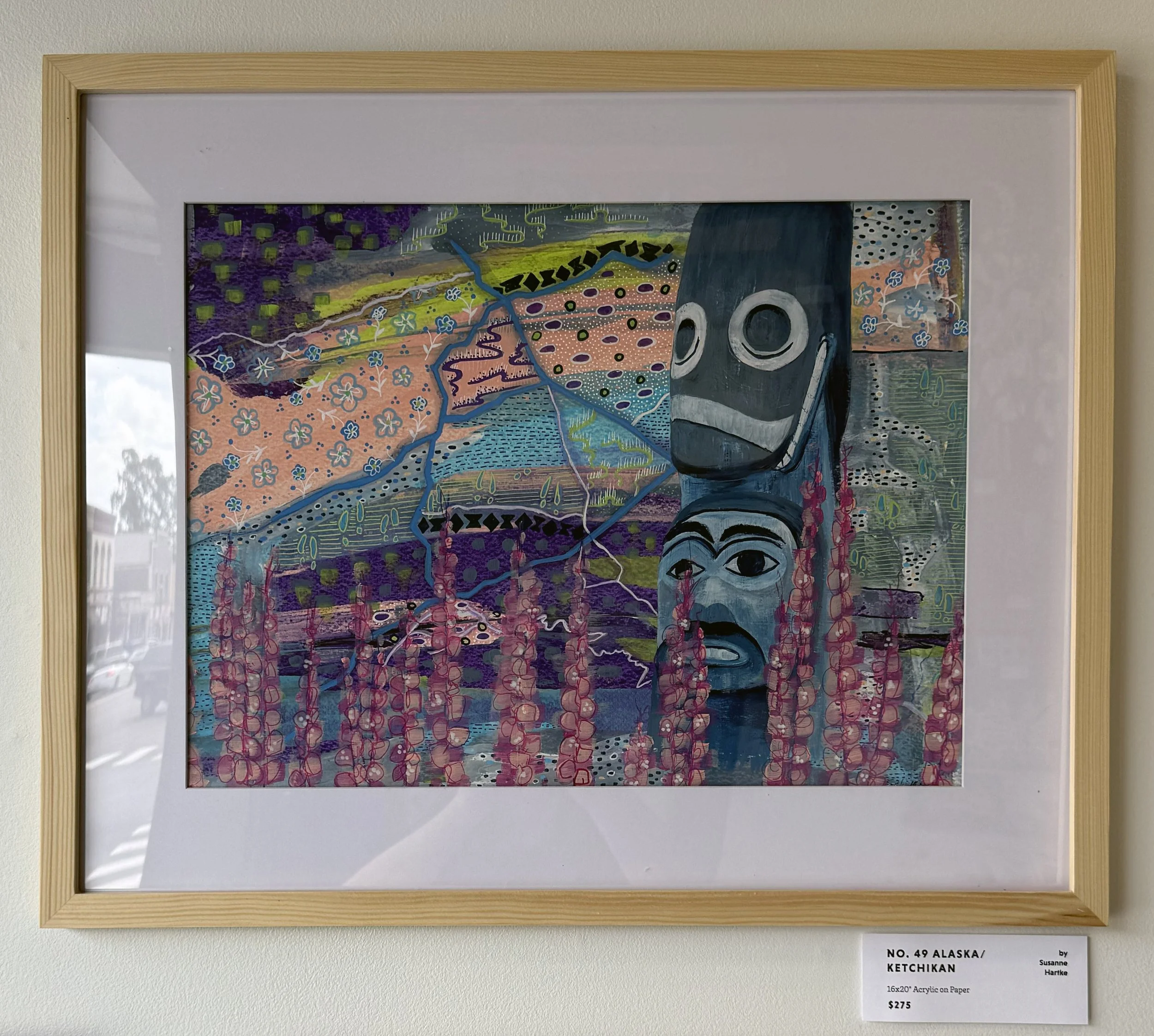
No. 49 ALASKA / KETCHIKAN
The 11th and 12th paintings in the collection bring us to the last two states to join the Union, Alaska and Hawaii. I would guess your average American hasn’t visited either, but Susanne has been to both!
She wasn’t sure what to expect when they planned a trip to Alaska, assuming it might just be white with snow, but recalled how pleasantly surprised she was by the lush color, flora, and rich Native culture she saw there. This piece features one of the many totem poles in Ketchikan, Alaska, which boasts the largest collection of Native American totem poles in the world.
Amidst the patterns you can spot swirls of northern lights and Alaskan forget-me-nots.
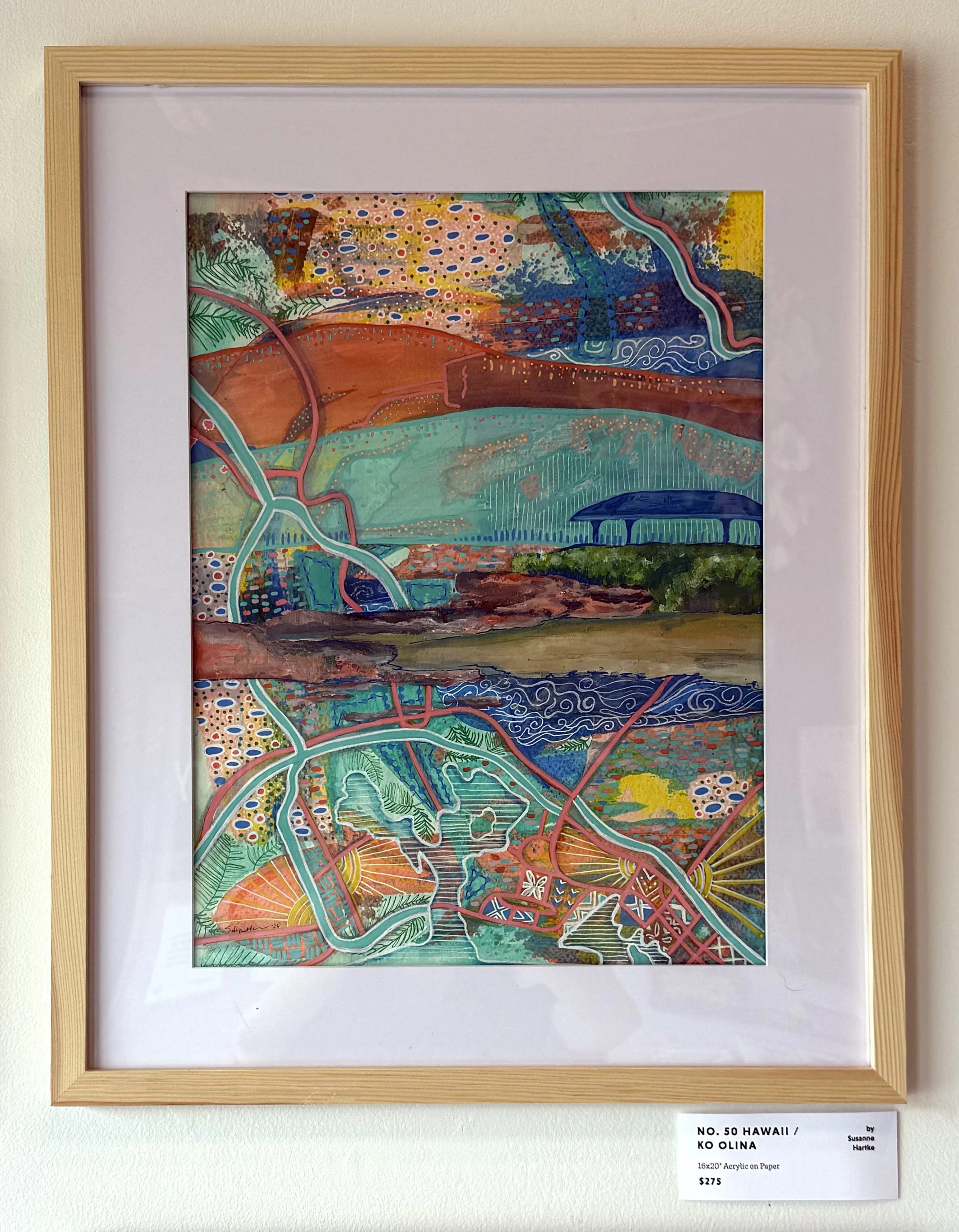


No. 50 HAWAII / KO OLINA
And the last piece in the series features a scene from Oahu, Hawaii. You can find Hawaiian tapa cloth patterns, water waves, a sun fragmented across sections of the map, palm tree leaves, and some blue beaded leis hidden among the patterns.
Susanne recalled that after seeing the whole collection together, she returned to this painting to add a bit more color and detail. I love where it landed, especially the mix of warm and cool tones in the color palette.
One of our favorite exchanges from our chat with Susanne, where Skylar and I reacted to the collection as a whole follows:
I said “I love when our visiting artists put up a show as a cohesive body of work, because I love hearing about how you developed the things that you wanted to keep consistent across the collection. That, to me, feels like how you can identify a specific artist's work, by recognizing, ‘Oh, this element is the same across all of these pieces.’ It’s almost mathematical, ya know, which elements are we holding constant... and which variables are we letting flow? So in this collection, you let the color palettes flow, you let the locations and compositions flow, and you held steady the map lines and the pattern work.”
Skylar responded “I feel like that really speaks to the broader idea of the collection, in that you are going through all these different physical locations and all these different life journeys, but what you keep consistent is you.”
Susanne said “Oh! I just got goosebumps.”
It was a lovely moment.
On a final note, we love to ask our visiting artists at the end of each conversation what they want people to take away from their art. Susanne’s response to this was simple, understated, and lovely: “I’d like them to lean in and look closer.”
And we’ll close with an invitation: if you find yourself in Geneseo this Friday evening, September 18th, from 6-8pm drop by The Gallery to meet Susanne, enjoy her artwork, and lean in and get a closer look in person! You can also follow along with Susanne’s work on Instagram or perhaps you can commission her to turn a favorite place of your own into a colorful, patternful (not a real word), abstract masterpiece - she told us she’d be open to making commissioned artwork!
If you made it all the way to the end here, thank you, thank you, thank you, for supporting local artists. It means more than you know.
-Joanna @ The Gallery